Death by a Thousand Clicks: How Tiny Design Mistakes Are Quietly Draining Your Revenue
Nobody abandons a website because of one bad button. They leave because of a feeling — a low-grade friction that builds up across a handful of small interactions until the effort just doesn't feel worth it anymore. They close the tab, go back to Google, and find someone else.
This is the part of digital design that's hardest to sell in a boardroom: the losses are invisible. There's no error message, no crash report, no angry email. Just a slightly lower conversion rate that everyone assumes is a traffic problem or a pricing problem or a seasonal thing. Rarely does anyone point at the checkout flow and say, "that's where we're losing people."
But that's often exactly where they're being lost.
What Behavioral Psychology Has to Say About Friction
Humans are, at our core, deeply lazy decision-makers. Not in a bad way — it's actually a survival mechanism. Our brains are constantly running a cost-benefit calculation: is the reward worth the effort? When the effort feels too high, we bail. Psychologists call this "cognitive load," and digital designers deal with its consequences every single day.
Every extra step in a form, every unclear label, every moment where a user has to stop and think about what to do next — all of it adds to the cognitive load. And cognitive load is the enemy of conversion.
Daniel Kahneman's work on System 1 and System 2 thinking is useful here. System 1 is fast, automatic, intuitive. System 2 is slow, deliberate, effortful. Good UX keeps users in System 1 mode — things feel obvious, natural, easy. Bad UX forces users into System 2 — they have to actually think, and thinking takes effort, and effort creates friction, and friction creates abandonment.
The goal of great design isn't to impress people. It's to get out of their way.
The Form Field Problem
Let's start with one of the most common conversion killers: forms. Specifically, forms that ask for too much.
There's a well-documented phenomenon in UX research: every additional field in a form reduces completion rates. The exact drop-off varies by context, but the principle is consistent. People will fill out a short form. They'll hesitate at a medium one. They'll abandon a long one.
And yet, it's incredibly common to see contact forms with six, seven, eight fields — phone number, company size, industry, how they heard about you — all required before a human being will respond. From the company's perspective, this data is useful. From the user's perspective, it's a toll booth.
The fix is usually uncomfortable: cut fields you think you need. Start with name, email, and a single open text box. You can collect everything else later, once you've earned the relationship. The data you get from a completed short form is infinitely more valuable than the data you never get from an abandoned long one.
Navigation That Makes People Feel Dumb
Here's a quick test: go to your website and try to find your pricing page in under five seconds without already knowing where it is. Then try to get to your contact page from your blog. Then try to figure out, from your homepage, what you actually do.
If any of those felt difficult, you've found friction.
Navigation design is one of those areas where internal familiarity becomes a liability. Your team knows your site so well that nothing feels confusing. But a first-time visitor is starting from zero. They don't know your product categories, your naming conventions, or your internal logic. If your navigation requires any amount of interpretation, some percentage of visitors will give up.
The most effective navigation is boring. It uses words people already know, puts the most important pages where people expect to find them, and doesn't try to be clever. Creativity is great in a lot of places. Your main nav is not one of them.
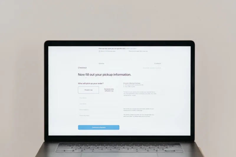
Checkout Flows and the 70% Problem
The Baymard Institute has been studying e-commerce checkout for years, and one of their most cited findings is that the average cart abandonment rate hovers around 70%. Seventy percent. That means for every ten people who add something to a cart, seven of them leave without buying.
Some of that is unavoidable — people browse, comparison shop, get distracted. But a significant chunk of that abandonment is design-driven. Required account creation before purchase. Surprise shipping costs appearing on the last screen. Payment forms that don't autofill. Progress bars that show five steps when the user was expecting two.
Each of these is a small thing. None of them individually would tank your conversion rate. But together, they create an experience that feels like work, and buying something should never feel like work.
The quick wins here are well-established: offer guest checkout, show shipping costs early, minimize the number of screens, use address autocomplete, and make the "place order" button impossible to miss. These aren't revolutionary ideas — they're just things a lot of sites still haven't done.
Micro-Interactions That Send the Wrong Signal
Micro-interactions are the small, often overlooked moments of feedback that a digital product gives its users: the button that changes color when you click it, the loading spinner that appears when a form is processing, the error message that explains what went wrong.
When these are done well, users don't notice them. When they're done poorly — or missing entirely — users feel uncertain. Did my click register? Is this thing loading or is it frozen? Did my payment go through?
Uncertainty is friction. And friction at the moment of purchase is particularly damaging because it introduces doubt right when you need confidence.
A button that doesn't visually respond to a click feels broken. A form that submits without any confirmation leaves users wondering if they need to try again. An error message that just says "something went wrong" without explaining what or how to fix it turns a recoverable moment into a lost customer.
These details are small and cheap to fix. They're also the difference between an experience that feels polished and one that feels like an afterthought.
The Real Cost of "Good Enough"
Here's where the business case becomes hard to ignore. If your site converts at 2% and you fix the friction points that bring it to 2.8%, that's a 40% increase in revenue from the same traffic. No additional ad spend, no new content strategy, no sales hires. Just a better experience for the people already showing up.
That's the argument for investing in UX that actually resonates with executives: it's not about making things prettier. It's about not leaving money on the table.
At RTA Projects, we think about design as infrastructure. The same way a poorly designed building makes it harder to work in, a poorly designed digital experience makes it harder to buy, engage, or trust. And just like building infrastructure, the problems are often invisible until something breaks — or until someone finally measures what's quietly walking out the door.
Good design isn't a luxury. Bad design is just an expense you haven't fully calculated yet.