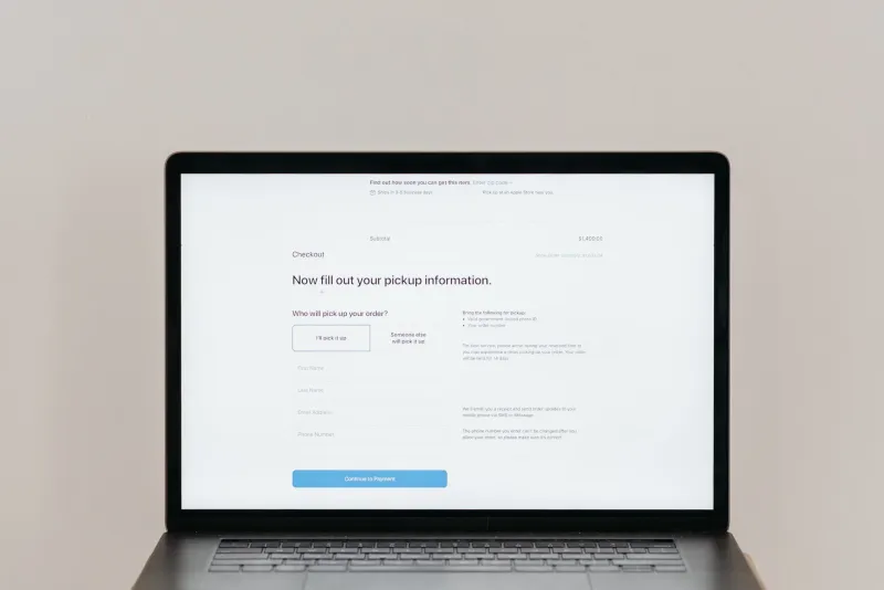
Somewhere along the way, "frictionless" became the highest compliment you could pay a digital experience. One-click checkout. Instant approvals. Skip the form. Auto-fill everything. The underlying assumption is that any resistance between a user and their goal is a failure of design—a leak in the conversion funnel that needs to be patched.
It's a reasonable instinct. And it's also, in a surprising number of contexts, completely wrong.
The obsession with frictionless UX has quietly created a generation of products that are fast to use and easy to abandon. The same design logic that removes every obstacle on the way in often removes every reason to stay. And for certain categories of business, that tradeoff is quietly killing lifetime value.
What We Actually Mean by Strategic Friction
Let's be precise here, because "friction" gets used loosely. We're not talking about slow load times, broken forms, or confusing navigation. That's just bad design, and it should absolutely be fixed.
Strategic friction is intentional resistance—a moment designed to make a user pause, confirm, or reflect before proceeding. It's the "are you sure?" before a destructive action. It's the extra step in a high-stakes financial decision. It's the deliberate pacing of an onboarding flow that teaches before it unlocks.
The key word is intentional. Strategic friction is designed with a specific behavioral or business outcome in mind. It's not an accident. It's a choice.
The Psychology Behind Productive Resistance
There's real behavioral science underneath this. When a decision feels too easy, our brains often discount its importance. Cognitive fluency—the ease with which we process something—is usually a good thing, but in high-stakes contexts it can actually reduce perceived value.
Studies on payment psychology have shown that people who pay with cash feel the cost more acutely than those who pay with a card. The friction of physically handing over bills makes the transaction feel more significant. Digital payments took that even further—tap-to-pay removes almost all friction, which is great for impulse purchases but problematic for decisions people might later regret.
Retailers who've leaned into this have seen interesting results. Adding a simple confirmation step—"you're about to spend $340, confirm?"—before completing a large purchase can actually increase satisfaction scores and reduce return rates, even if it slightly reduces conversion. The customers who proceed are more committed. The ones who bail probably would have returned the item anyway.
E-Commerce: When Fewer Abandoned Carts Isn't the Right Goal
Conventional e-commerce wisdom treats cart abandonment as the enemy. Every abandoned cart is a lost sale. So we one-click everything, save payment info, auto-apply discounts, and make the path to purchase as invisible as possible.
But here's the problem: not every completed transaction is a good transaction. Returns are expensive—operationally and environmentally. Customer service costs spike when buyers feel like they made an impulsive decision. And brand perception takes a hit when the post-purchase experience doesn't match the pre-purchase excitement.
Some DTC brands have experimented with adding a twenty-four-hour pause option on orders above a certain dollar threshold—not forcing it, just making it visible and easy. "Take a day to think about it" isn't a typical sales message, but for higher-consideration purchases, it builds trust. Customers remember that you didn't push them. That's a brand differentiator that no amount of retargeting spend can replicate.
SaaS: The Onboarding Paradox
In SaaS, the pressure to show value fast is enormous. Activation metrics dominate product roadmaps. Get users to the "aha moment" in under five minutes. Remove every barrier between signup and first use.
The problem is that products with genuinely complex value propositions can't be understood in five minutes. And when users don't understand what they've signed up for, they churn. They don't complain—they just stop logging in.
Some of the stickiest B2B SaaS products do something counterintuitive: they gate features behind completion steps. You can't access the reporting dashboard until you've connected your data source. You can't invite teammates until you've completed your own profile. These aren't technical limitations—they're deliberate design decisions that ensure users have the context they need before they encounter features that require it.
The short-term metric looks worse. Activation takes longer. Some users drop off. But the users who complete the flow churn at dramatically lower rates, because they actually know what they're using and why.
Financial Services: Trust Is Built Through Pause
Perhaps no industry has more to gain from strategic friction than financial services. And yet fintech's dominant design language for the past decade has been all about speed. Open an account in two minutes. Get approved instantly. Transfer funds immediately.
There's real user value in that speed. But there's also real risk—both for users and for the businesses serving them. Fraud rates in instant-approval products are higher. Buyer's remorse in fast-close lending products drives regulatory scrutiny. And the trust deficit in financial services broadly means that users who feel rushed through a significant financial decision often feel manipulated afterward, even if the product delivered what it promised.
Institutions that have added deliberate review periods for large commitments—a mandatory twenty-four-hour window before a loan funds, for example—report higher satisfaction scores and lower dispute rates. The friction signals that the institution takes the decision seriously. That's a form of brand communication that copy alone can't achieve.
How to Know When Friction Is the Right Move
This isn't a case for making everything harder. It's a case for asking a more precise question before you optimize: what behavior are we actually trying to encourage here?
If the answer is "a fast, low-consideration transaction," remove every obstacle. If the answer is "a committed, high-consideration decision that leads to long-term retention," friction might be your best conversion tool.
A few signals that strategic friction is worth exploring:
- High return or churn rates despite strong conversion numbers
- Customer satisfaction scores that dip post-purchase
- Support volume that spikes shortly after acquisition
- Products where misuse or misunderstanding creates downstream problems
In each of those scenarios, the conversion funnel is working. The user experience after the funnel isn't. And more often than not, the fix isn't downstream—it's a moment of intentional pause earlier in the journey.
The Bigger Picture
The best digital products aren't the ones that get out of the way the fastest. They're the ones that guide users toward decisions they'll be glad they made. Sometimes that means removing every obstacle. And sometimes it means building in a moment that says: slow down, this matters.
Knowing the difference is where the real design work happens.